

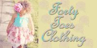
I am following Dear Lillie's example and asking for your help! I've been trying to decide between two different logo's and I like them both so much I can't seem to choose!!! I think I'm driving la parisienne crazy with my indecisiveness!! I know I would be getting aggravated at me! Well here they are....let me know which one you think best depicts "Princy n Paris"!
#1

This is what we started out with. I actually really like the blue but I'm more of a pink person so I asked her to change out the blue for a muted pink....
#2

This is the 1st logo I think I like a little better than the 2nd. It's really hard to see the details from the pic but it has delicate vines going all around and on the inside is a faint image that looks similar to damask.
#3

Here is the same logo with a slight change in font placement
#4

Here is the font going straight across
#5

Here is the 2nd logo with the muted pink and the name stacked. I like how the "n" is in the center . I think I'm leaning more and more towards this one! What do you think? I would love to hear from you!


#5 just jumps out at me- LOVE that one!! #2 is my 2nd choice. Hope that is helpful Prencie. xo
ReplyDeletenumber 5 for sure! It's so Princy n Paris, ya know? very elegant and pretty :)
ReplyDeleteok, so i am more of a round kinda girl - so the very tippy top one of #1 stands out to me. i like where the letters are placed and i like the size of it...maybe have that one, but put the pink in there, because i agree, pink suites you much better!
ReplyDeletegood luck!
I like number 5 and then 1!!!!! It is sooo hard aking these choices!
ReplyDeleteOooo, I love #5!!!! Just something about it, I think it's a little more commanding but still so sweet and feminine. Does that make sense?!:) Good luck!
ReplyDeleteI love #5, the logo gets kinda lost in all the others but I think it really stands out in #5.
ReplyDeleteI LOVE #5 too. It's so pretty.
ReplyDeleteDebra & Morgan
I really like number 1 although number 4 is nice too. Good luck!
ReplyDeleteI really like #5.
ReplyDelete#5 is my vote! but because I LOVE pink!! How fun!
ReplyDeleteI am found of Number 2...but they are all very pretty! I love your blog and especially enjoy the music! ^-^
ReplyDeleteThey're all gorgeous, but I like number 5 the best! Good luck choosing! XO!
ReplyDelete#5, and then #3 if you want more subtle. definitely #5 stands out best of all! Hugs and blessings to your beautiful site! :) xx Jenn
ReplyDeleteThank you everyone for your help!! As I was writing this post I think I already knew that I wanted #5 once I saw them all together on the same page:) Woo hoo! Stay tuned for the new logo finished and ready to be used:)
ReplyDeleteLove the last one!!!! Can't wait to see how it turns out! Amazing!!!! So excited for you!
ReplyDeleteOh - I agree! I LOVE that last one!
ReplyDelete